GAGE ACADEMY OF ART
Services
Brand Identity
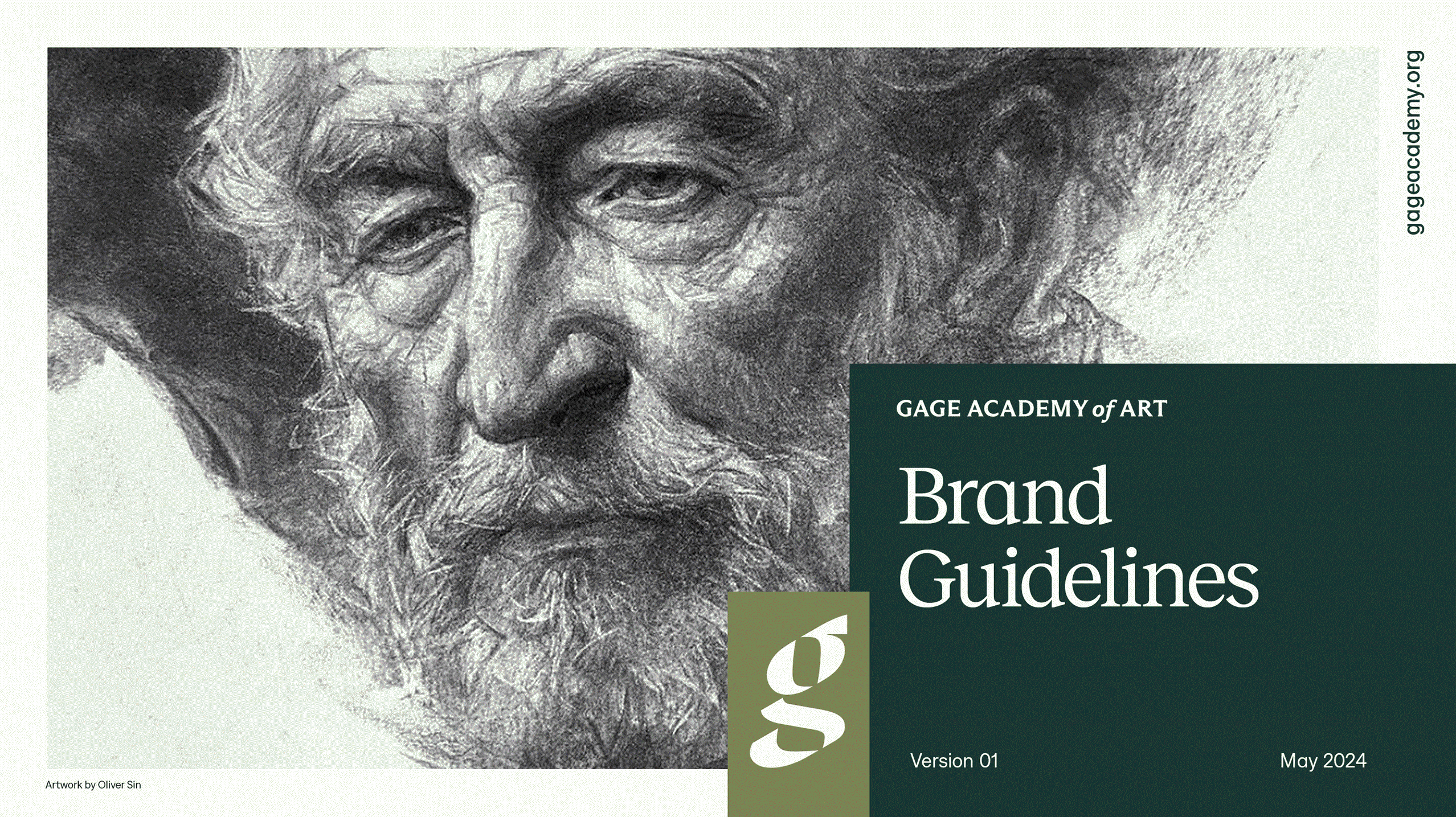
Brand Guidelines
Creative Direction
Partners
Strategy · Kevi Louis-Johnson
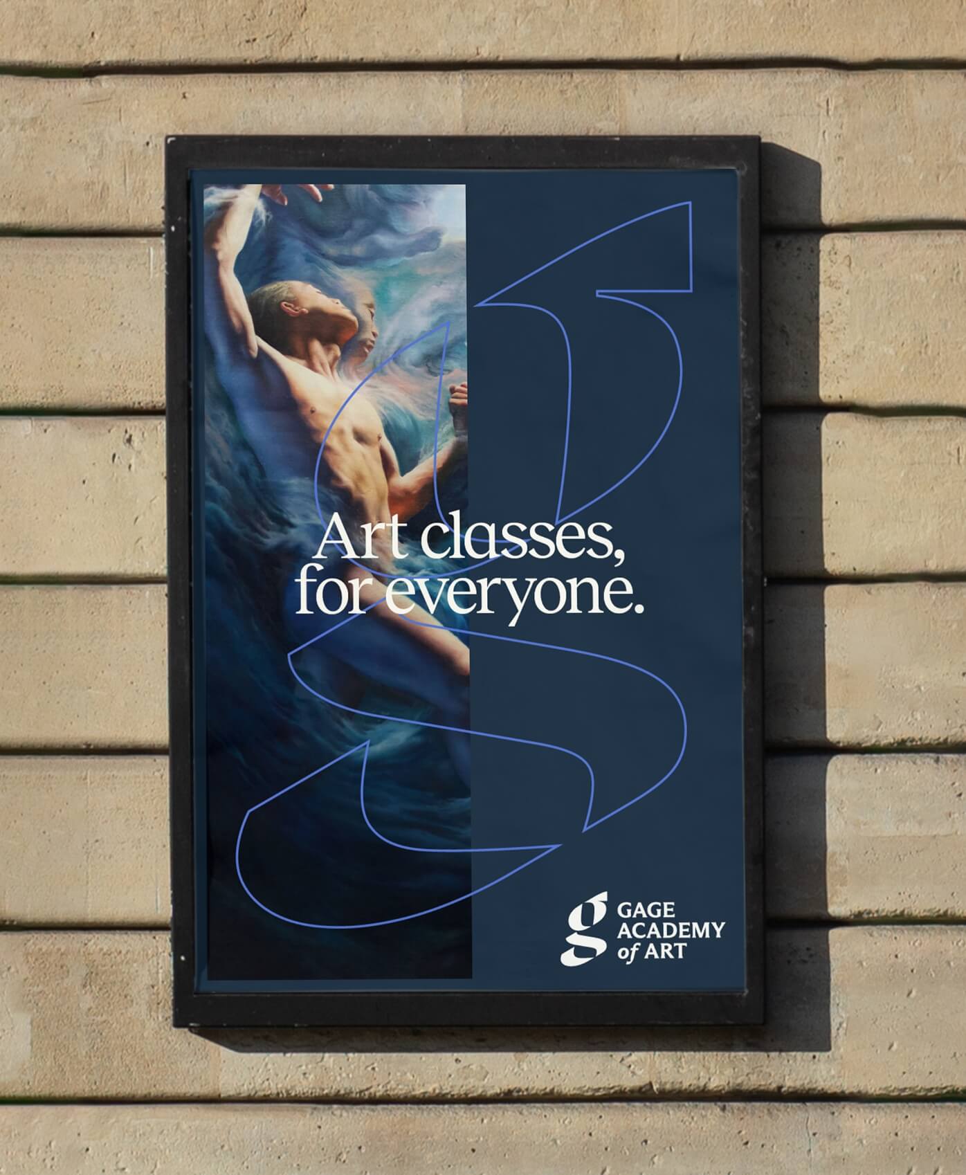
Gage’s relocation to a modern downtown campus prompted a brand identity refresh to signal a new chapter without sacrificing its legacy.
For over 30 years, Gage Academy of Art has been providing the community with art programs based on classical techniques and methodologies, yet their vision for the future of art is unmistakably modern. As they work to make the arts more inclusive and accessible, they sought a brand identity that could reflect their status as a contemporary organization welcoming artists of all ages and abilities.
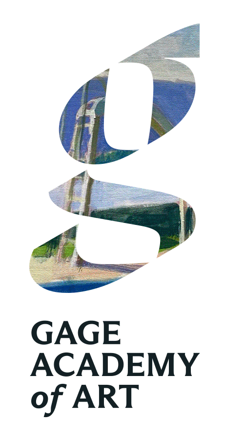
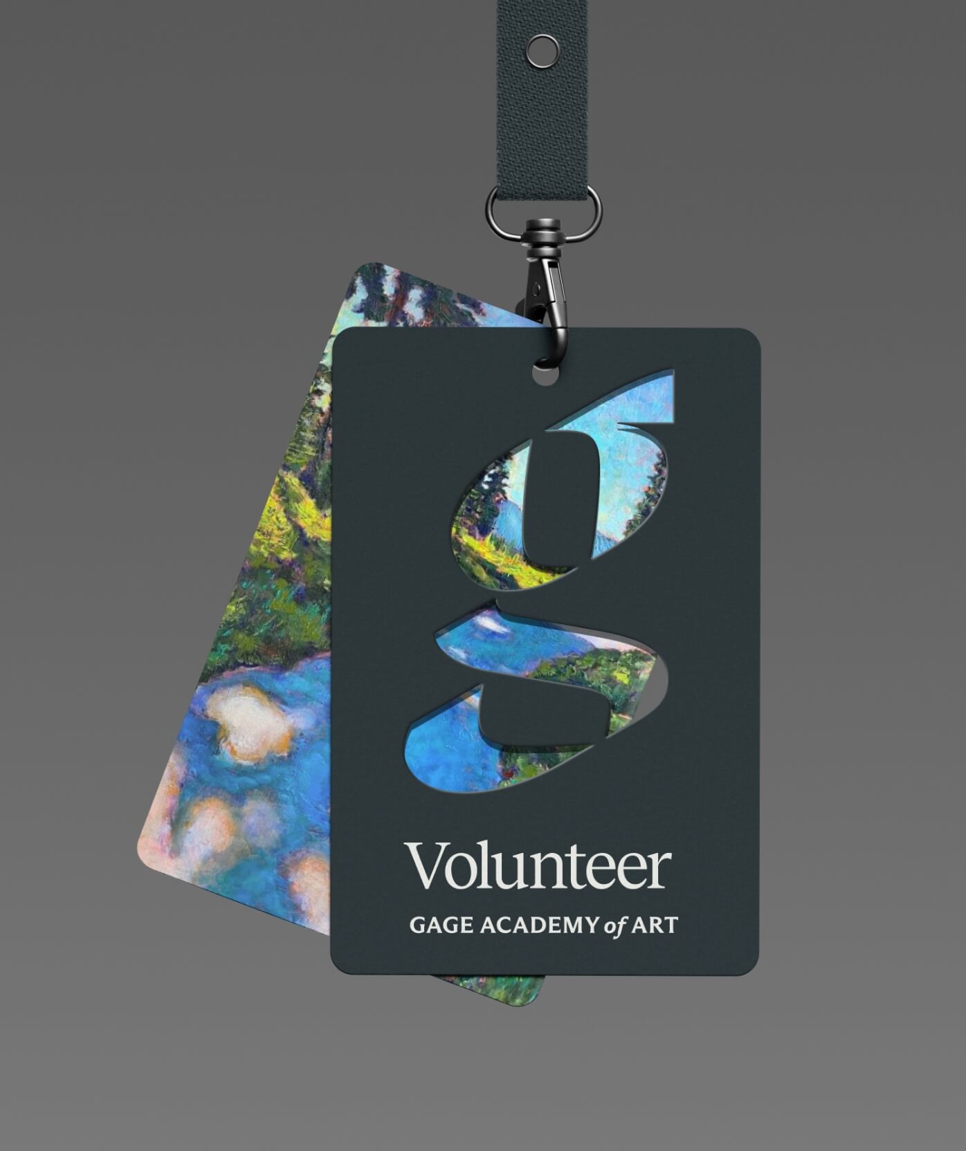
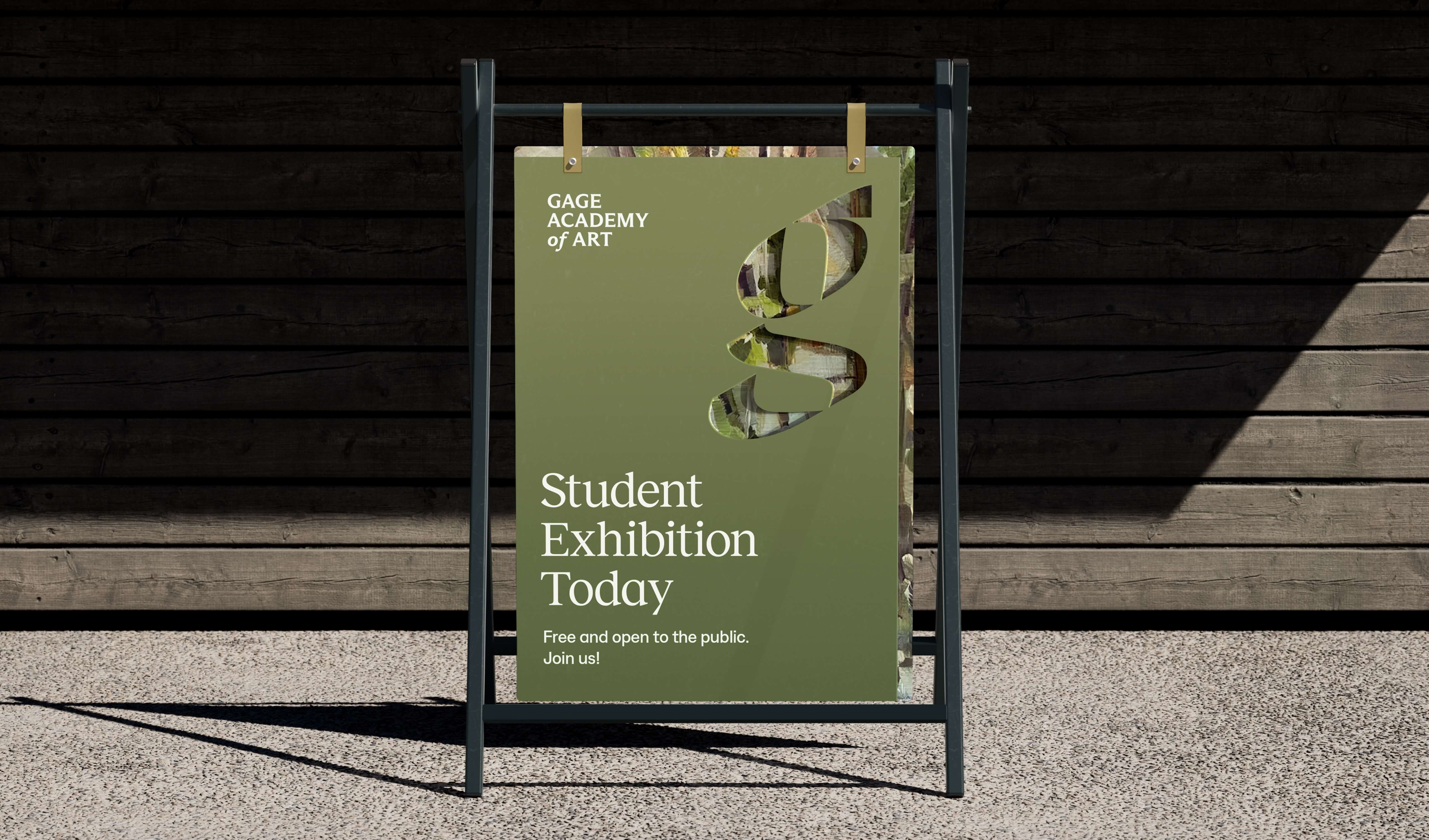
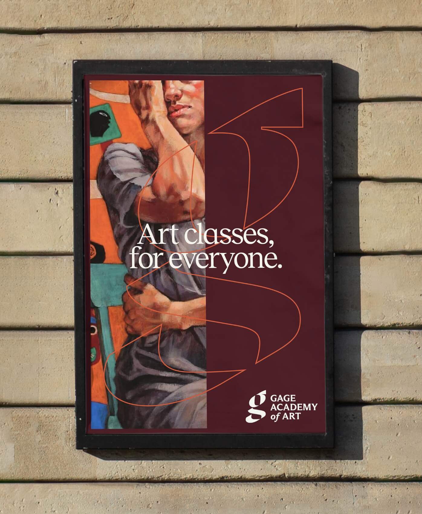
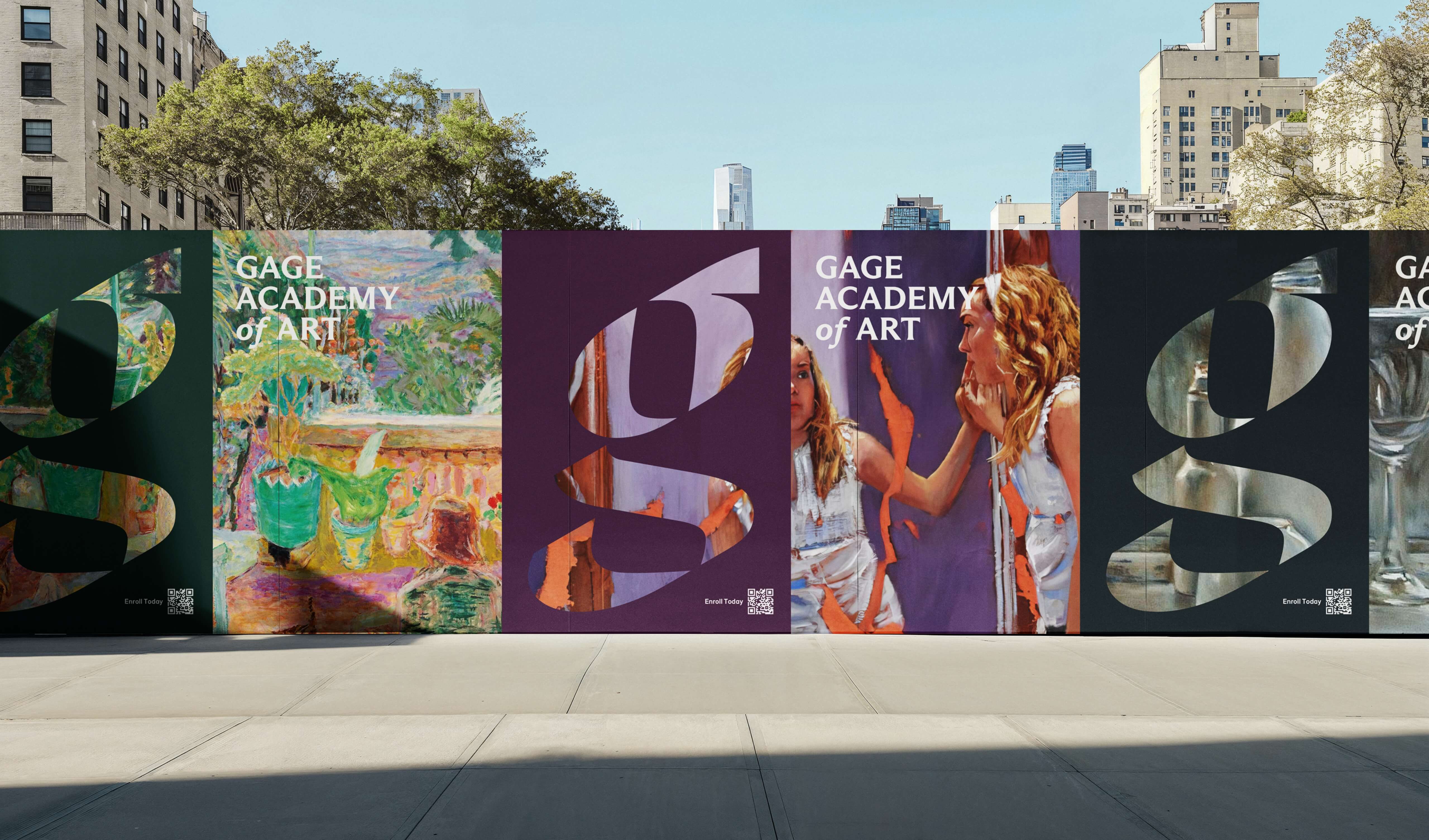
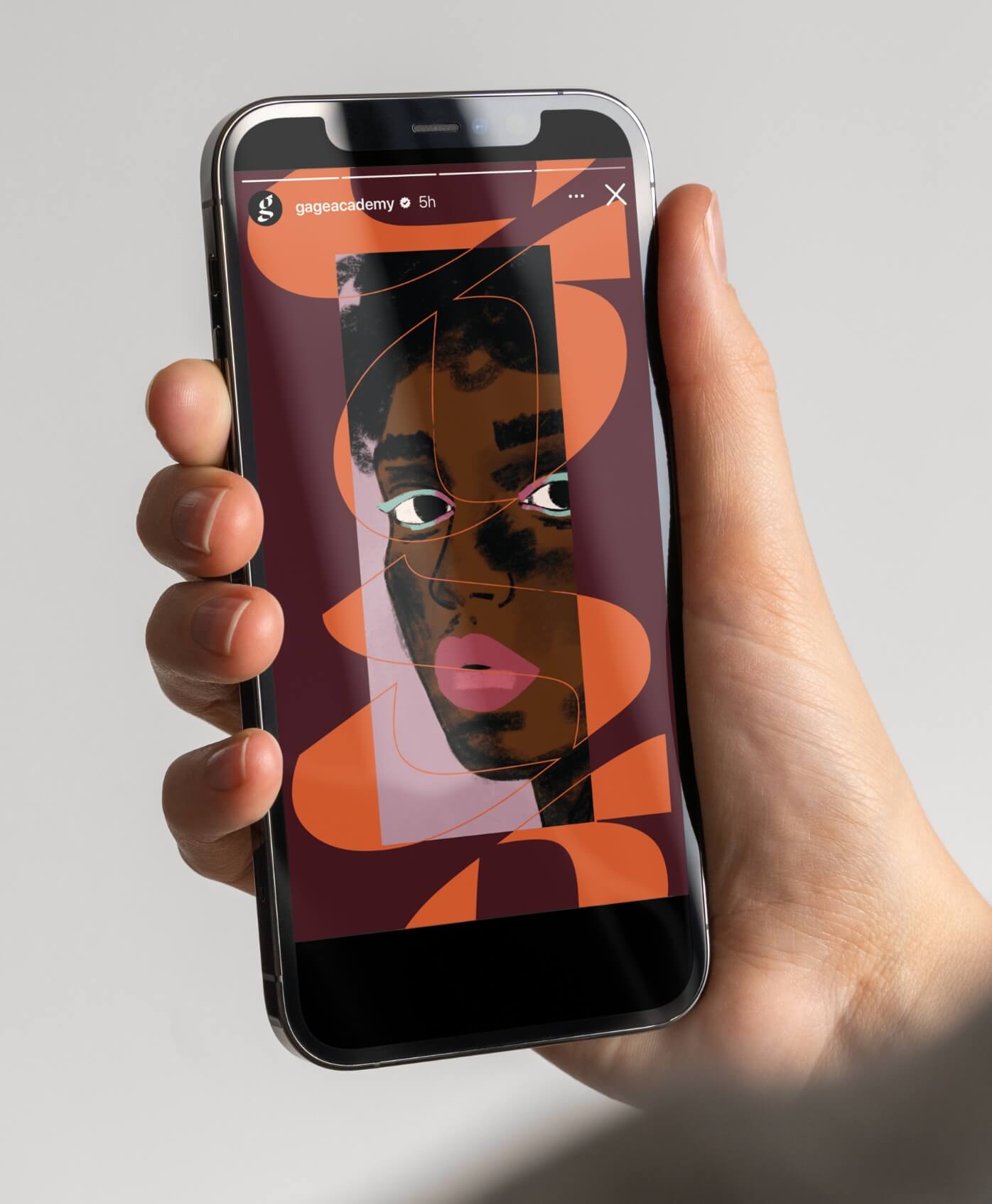
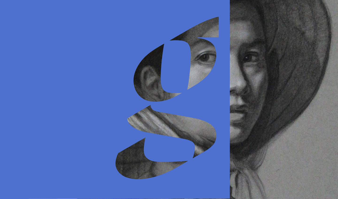
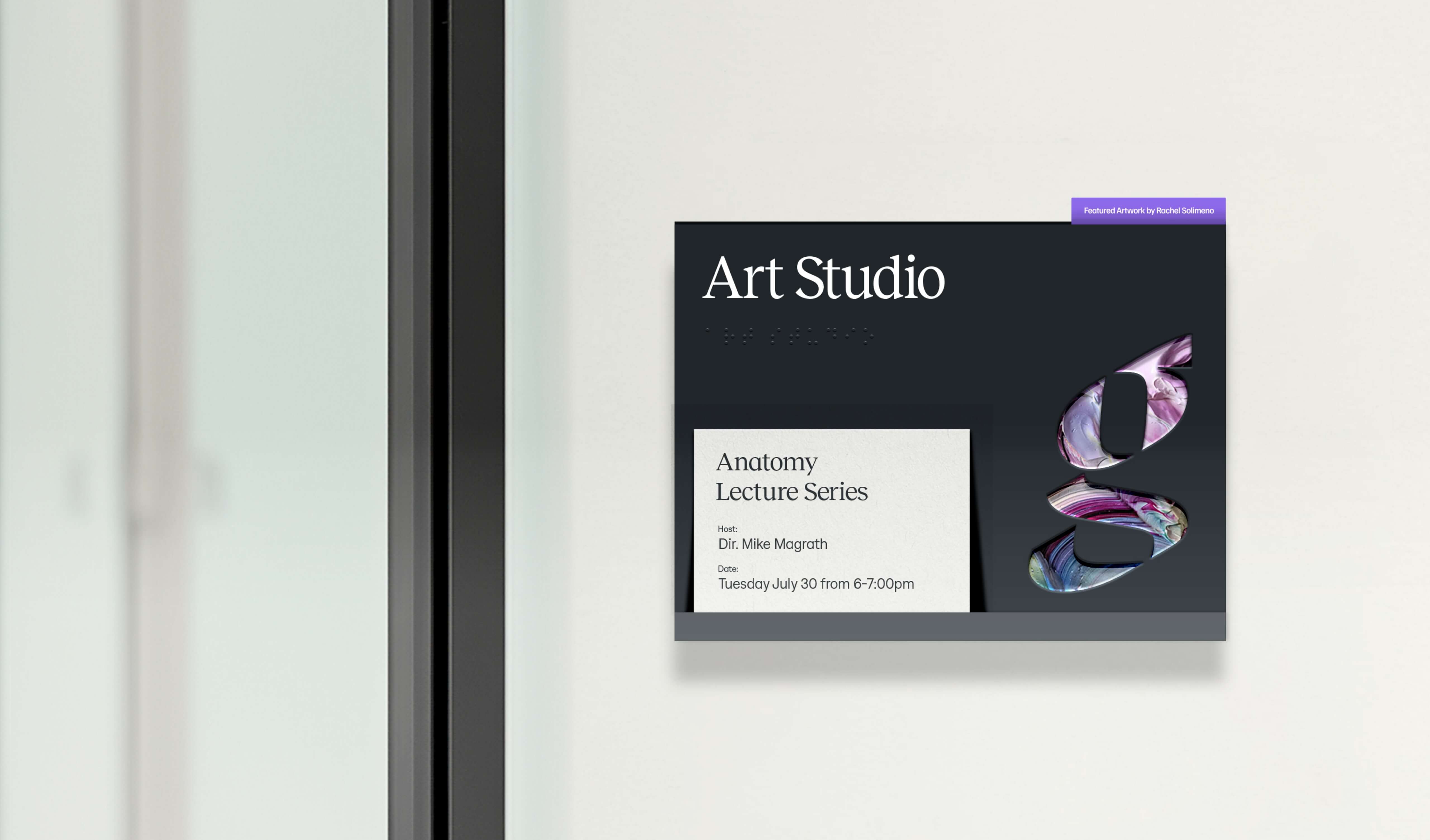
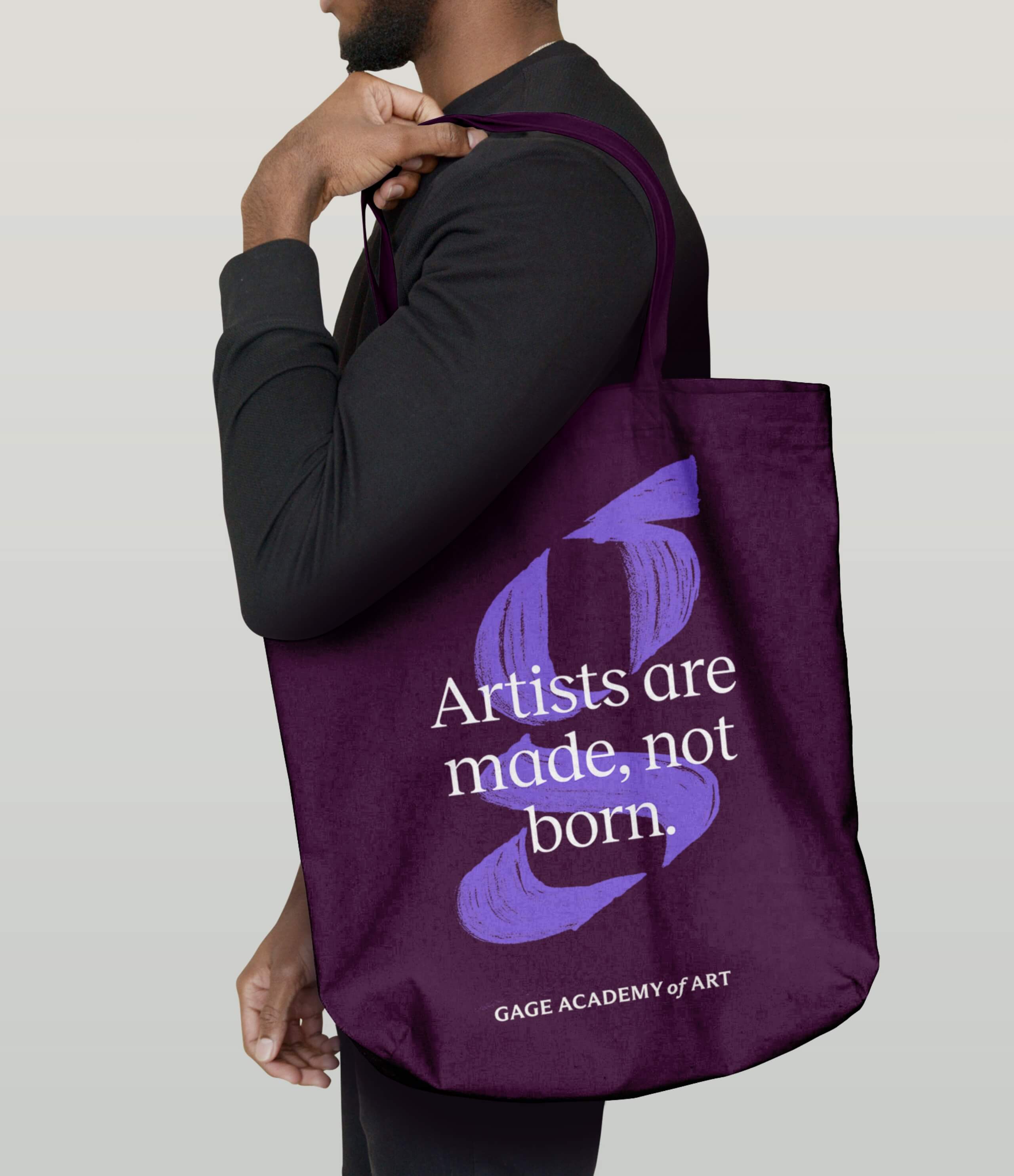
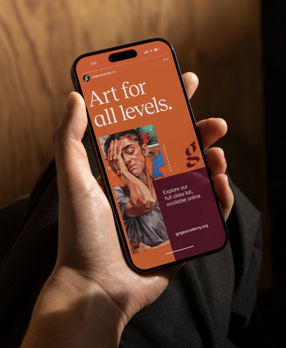
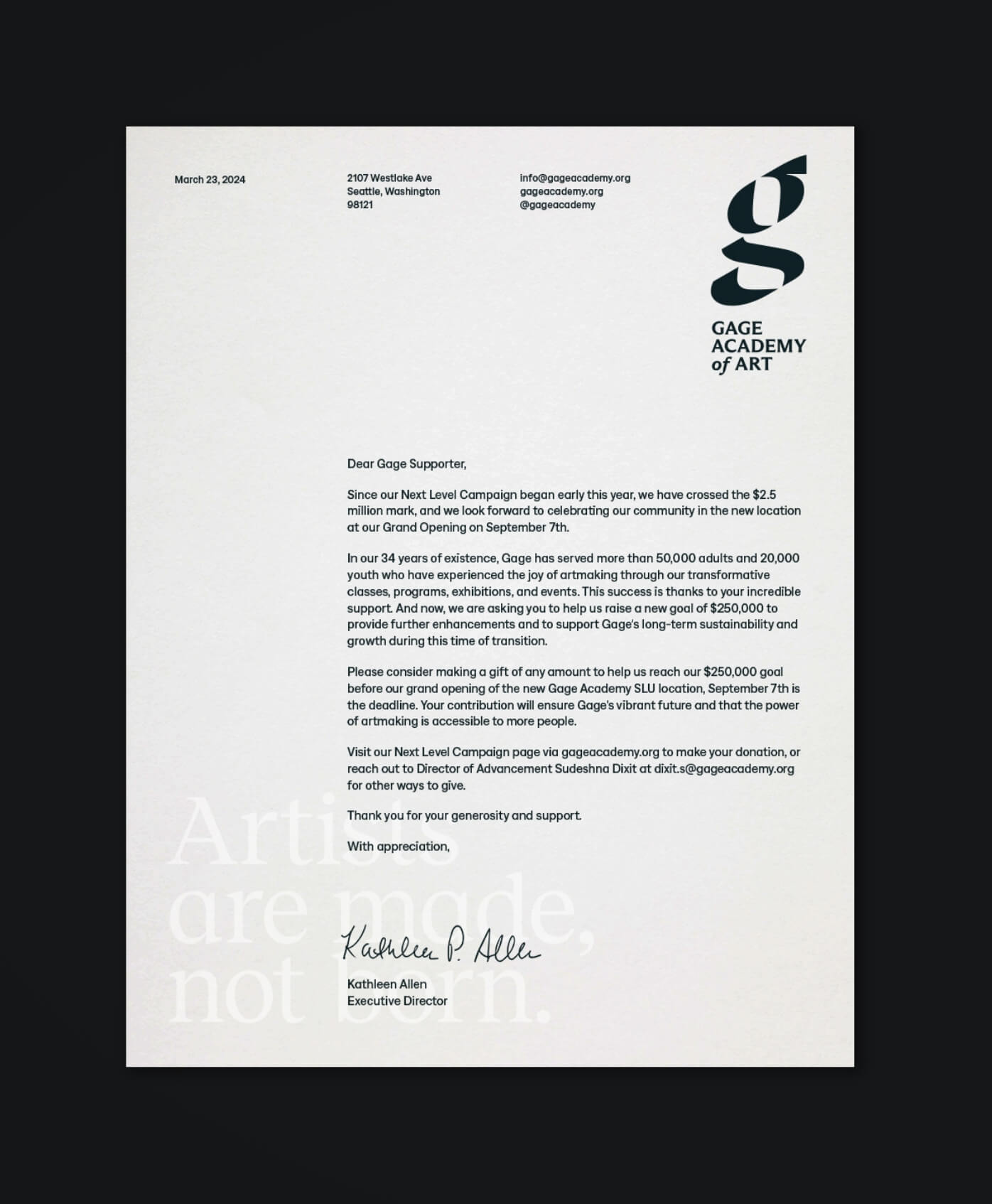
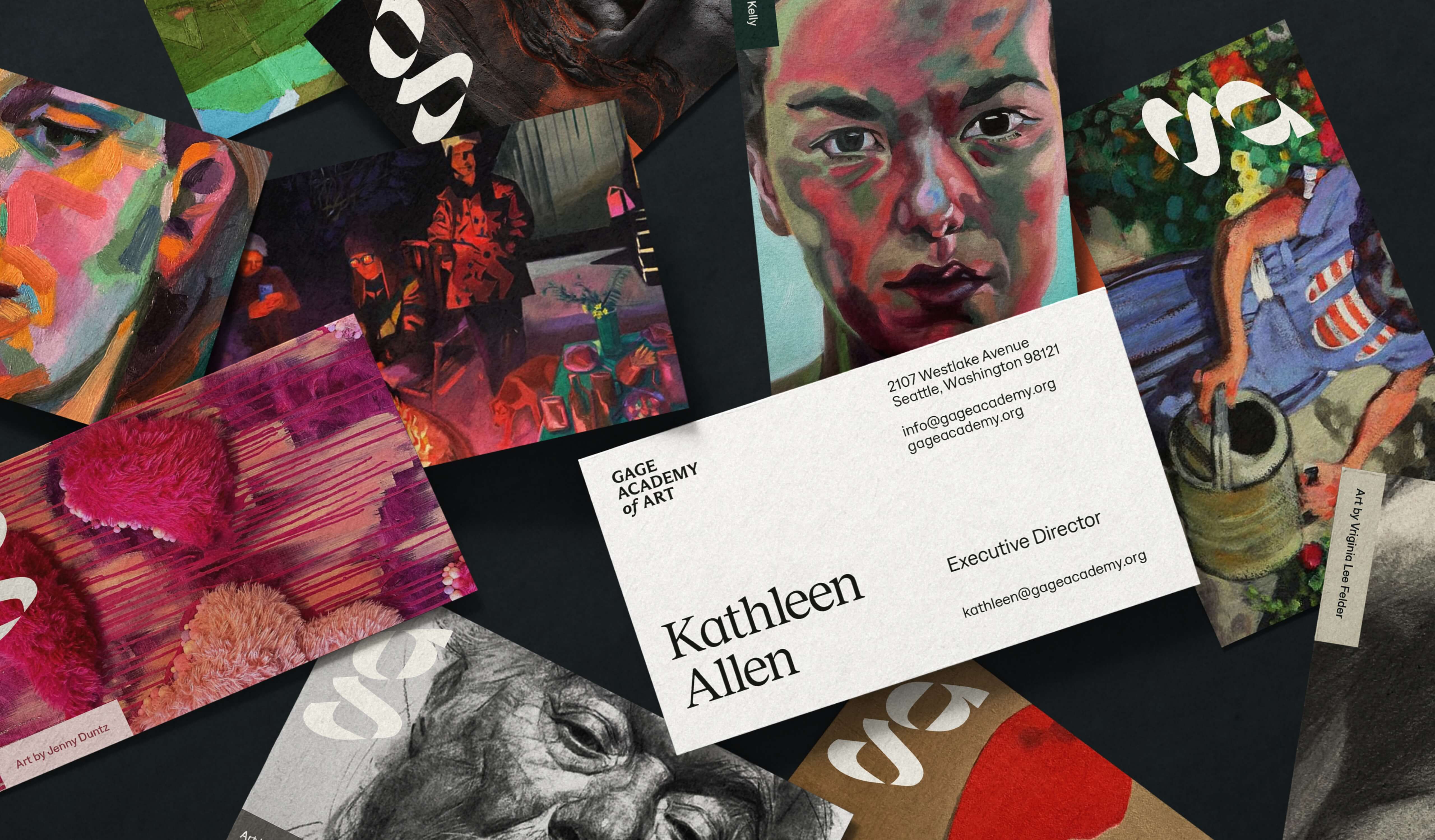
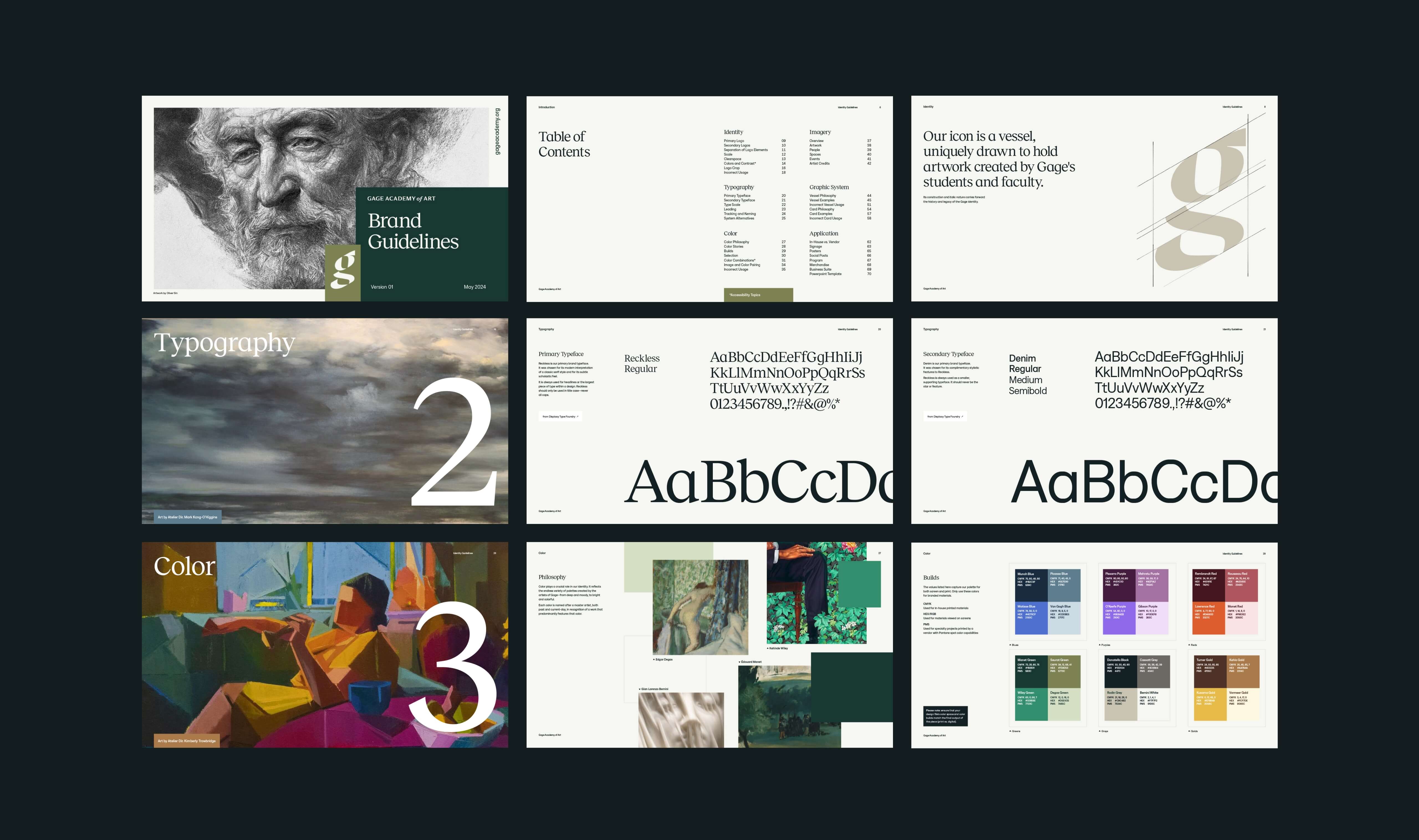
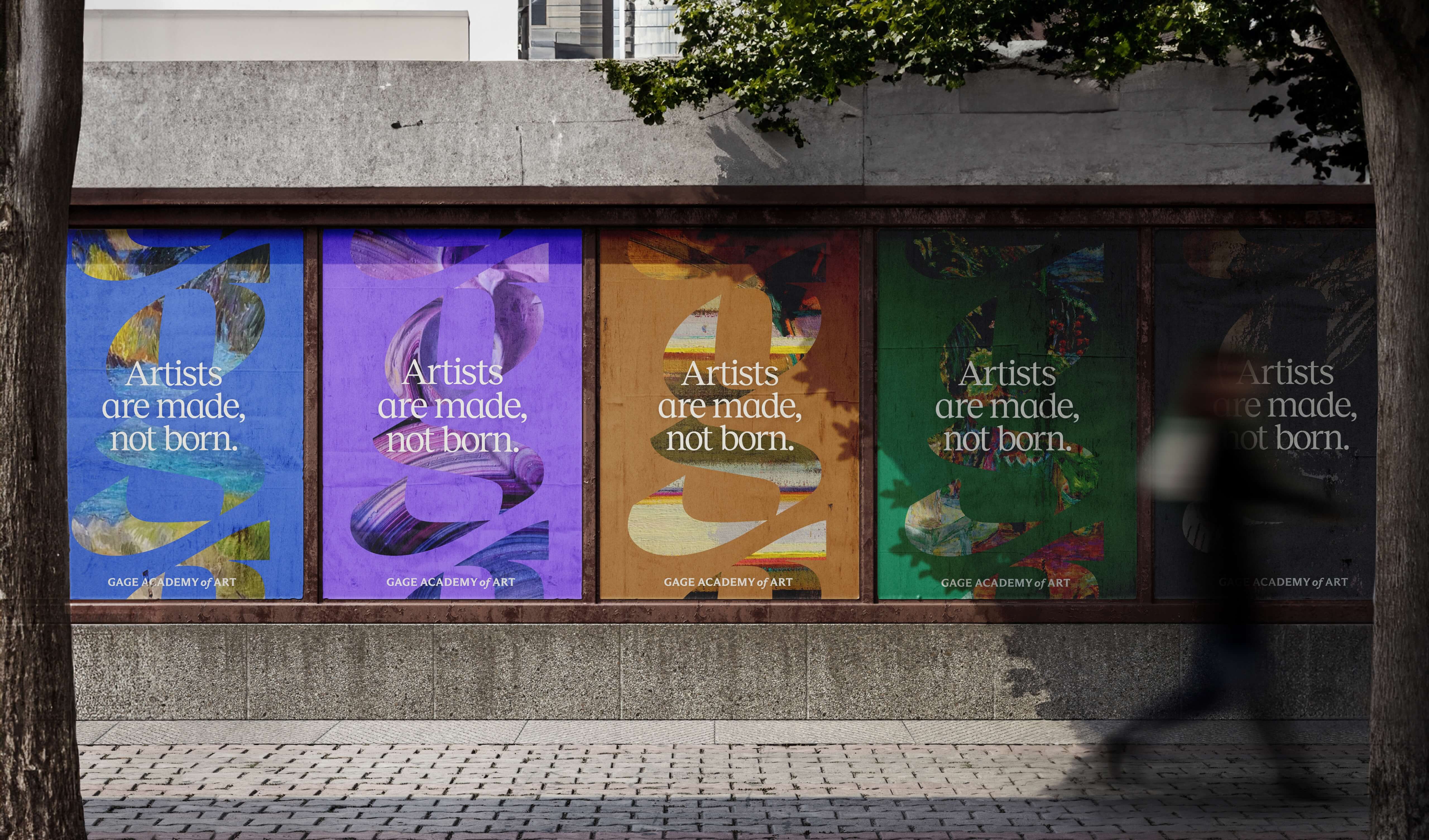
We were asked to reimagine their iconic "g" icon as a vessel—one that could become a container for artwork, a window into Gage’s world, and a shared lens for their vast community. We retained the lowercase character, italicized slant, and calligraphic details, but modernized the letterform with clean lines, a bolder weight, and distinct parts in order to improve reproducibility, increase legibility, and most importantly, allow for a flexible and ever-changing expression.
To complement the new icon, we developed a uniquely colorful palette and a flexible card system suitable for any art style, all governed by robust guidelines to maintain clarity, consistency, and recognizability. The refreshed brand is the product of a deeply collaborative effort between faculty, staff, students, and volunteers, and serves as a foundation on which to grow into the Gage of tomorrow.